Assessment Drawings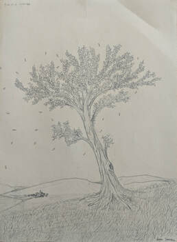
|
|
|
|
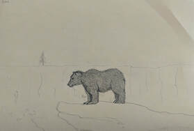
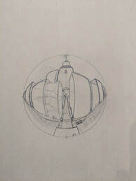
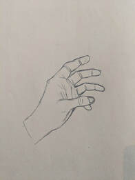
These four drawings were used to assess our skills at various aspects in art. One was of a tree, another was an animal, then a city drawn using perspective, then finally a hand.
|
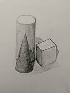
Pencil and Color Shape Grouping
|
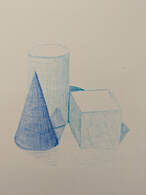
These drawings were meant to be done while looking at a actual shapes for reference. The first image was made with a regular pencil, while the other was made with two colored pencils. The purpose was to explore realistic shading.
|
Still Life Compositional Sketches
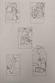
These sketches were meant to be quick and simple, and were drawn while looking at an assortment of random objects as reference. These are to be used as a point of judgment for what perspective we'll be using when making the final still life drawing.
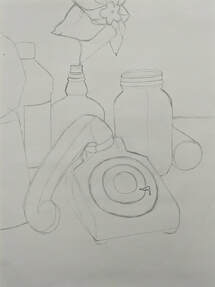
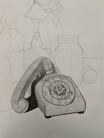
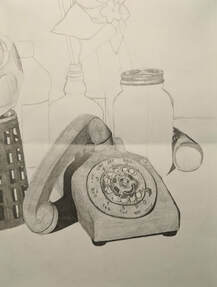
Still Life In Progress Pictures
|
|
|
Still Life Final
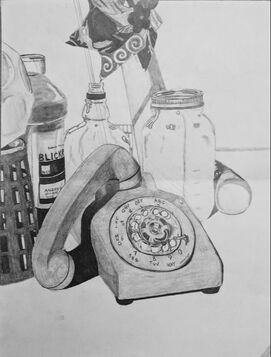
1.) While I didn't arrange the composition, I decided the vantage point from which I would draw it from, I tried to balance the use of negative space so that the work wouldn't appear too crowded, and I think I found a good mix of space.
2.) I did use a wide range of values, ranging from white to black, there were also intermediate colors and gradients in between transitions.
3.) I actually drew another still life about a year ago, so that experience really helped me with this one.
4.) The transitions of values was made by a differentiation of pressure applied when making them, and the blending was made through the use of blending stubs.
5.) How I interpret a texture really isn't that important to me when creating still life's, my strategy when drawing these, especially from a photo, is to draw what I see, and not what I think I see.
6.) If I were to redo this piece, I'd probably add more writing to the bottles and add more detail to the glass.
Pen and Ink Unit
Practices
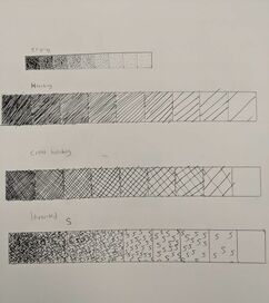
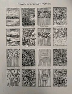
On this sheet I drew four different value charts ranging from dark to light, with each one using a different shading technique.
|
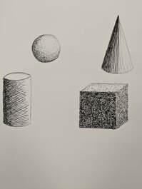
For this practice I had to use the different shading techniques from before on a corresponding shape.
|
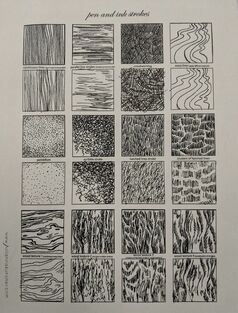
Texture Copy Sheets
|
|
For these two I had to copy the textures already printed on the paper onto a space below each one
Log and Spheres practice
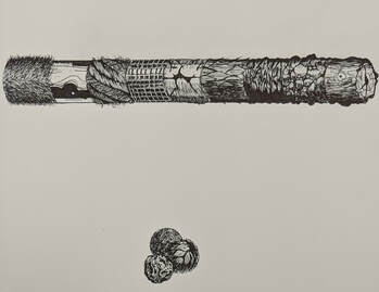
Here we watched a video and followed along to practice different textures on these four shapes.
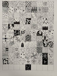
100 Pattern Ideas:
For this, we had to sketch out 100 different patterns that would be used as a baseline for the rest of the unit. There had to be a good mixture of light and dark themed patterns as well, so that future works would not blend and mesh together.
For this, we had to sketch out 100 different patterns that would be used as a baseline for the rest of the unit. There had to be a good mixture of light and dark themed patterns as well, so that future works would not blend and mesh together.
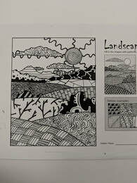
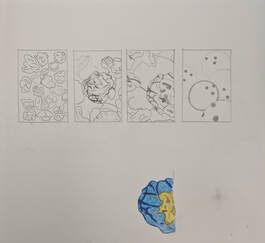
Pattern Landscape:
For this we had to use the patterns we had previously come up with to decorate the blank spaces in a landscape template. It was important to remember that there needed to be clear contrast between each different shape so that someone could differentiate between them easily.
For this we had to use the patterns we had previously come up with to decorate the blank spaces in a landscape template. It was important to remember that there needed to be clear contrast between each different shape so that someone could differentiate between them easily.
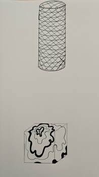
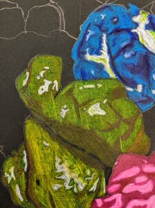
Shape Wrapping Patterns:
Here we had to use a pattern we had made and effectively wrap it around a three dimensional shape in order to understand how to bend and manipulate a pattern accordingly. This helps to create depth and a sense of realism in your works.
Here we had to use a pattern we had made and effectively wrap it around a three dimensional shape in order to understand how to bend and manipulate a pattern accordingly. This helps to create depth and a sense of realism in your works.
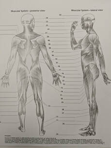
Pen and Ink reference photos
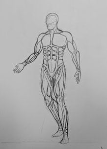
Pen and Ink Practice Sketches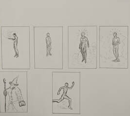
Pen and Ink Final, in progress picture
|
|
Pen and Ink Final
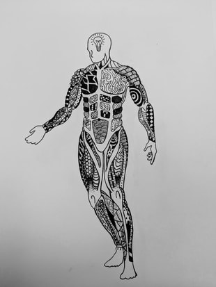
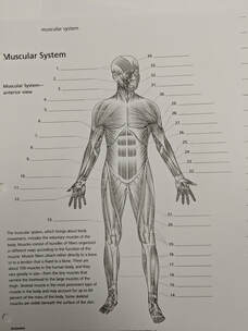
1.) The composition on this piece consisted of placing the patterns inside different groups of muscles. I think it was successful in terms of what I planned for.
2.) They are important in the fact that they make up the bulk of the actual figure, who himself is the centerpiece of the work.
3.) Value is important as it helps to distinguish the defining edges and shapes of each muscle, and thus adds clarity and distinction to the piece.
4.) I think the project is very well crafted, I took a great amount of time researching the musculature of the human body, and then figured out how to adjust each piece to the pose I put the figure in. On top of that, only one or two patterns is repeated, and gives a wide variety of such to look at.
5.) The main thing that helped me was the 100 practice patterns, as it gave me a deep pool of ideas to draw from.
6.) Its important so that the piece does not become flat, jumbled, or repetitive. You have to know which patterns fit well within a piece, and how to place them accordingly so they don't blend into each other from a distance.
7.) I think it will help to expand my creativity and problem solving skills, each of which were tested in this project.
8.) If I were to do this again, I think I would add more dark centered patterns to the figure.
Color Unit Practice Drawings
|
|
|
|
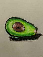
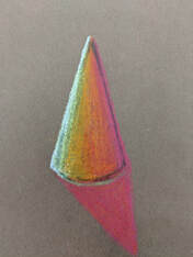
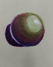
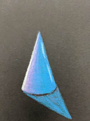
For all of these practices, I used a prisma colored pencil to shade and shadow three shapes in different color themes, and then finally complete a colored drawing of a fruit or vegetable, in this case an avocado.
Color Pastels
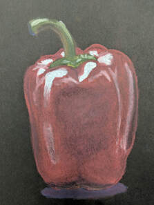
Here I used Pastel colored pencils to draw and shade a different vegetable, this one being a pepper. I didn't like the pastels as much as I did the Prismas, as they smudged and rubbed off much easier.
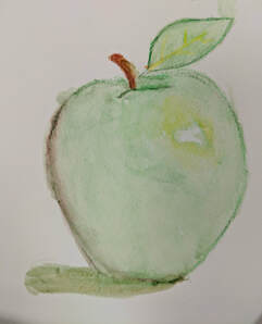
Water Color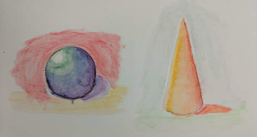
|
|
The final color practice I did involved water colors, where I put down the colors first with a pencil, and then blended it with water from a paintbrush. The first things I tried this on were the two shapes above, then I moved on to drawing a blending an apple. Both were hard, and the colors aren't as bright and vibrant as I would have liked.
Artist Research Paper
Takashi Murakami
Takashi Murakami was born on February 1st, 1962 in Tokyo, Japan. As a child he was a fan of anime and manga and originally planned to become an animator, later attending Tokyo University of the Arts. Eventually Takashi decided he wanted to major in Nihonga, a traditional style of Japanese painting. Though he earned a PhD in the subject he ultimately walked away, finding the community that surrounded it to be too political and secular. Takashi instead sought out more contemporary art styles. In 1994 he participated in the PS1 International Studio Program in New York City, where he stayed for a year. During this time he became inspired by western contemporary artists such as Anselm Kiefer and Jeff Koons before returning to Japan, where he would begin to develop and refine his art style. Afterwards he began to regularly exhibit his art at galleries across Europe and America, his plan being to build himself up in the western world before importing his style back to Japan. Said style was mainly built off aspects of Japanese “low” art at first, with Takashi finding “high” art confounding. In 2000 he started a practice he called “superflat”, where he would take his glossy and colorful “low” art pieces and introduced them to “high” art markets; he would then package and redistribute his “high” art as merchandise such as t-shirts or plushies and sell them for more affordable prices. Takashi quickly rose in popularity, with his works selling anywhere in the hundreds of thousands of dollars all the way to the tens of millions. In 2008 he was the only visual artists included in Time magazine’s 100 most influential people, and in 2010 he became the third contemporary and first Japanese artist to exhibit his pieces in the Palace of Versailles. Takashi is currently the founder and president of his own company, KaiKai KiKi, and often supports and advises the careers of young Japanese artists.
Takashi Murakami was born on February 1st, 1962 in Tokyo, Japan. As a child he was a fan of anime and manga and originally planned to become an animator, later attending Tokyo University of the Arts. Eventually Takashi decided he wanted to major in Nihonga, a traditional style of Japanese painting. Though he earned a PhD in the subject he ultimately walked away, finding the community that surrounded it to be too political and secular. Takashi instead sought out more contemporary art styles. In 1994 he participated in the PS1 International Studio Program in New York City, where he stayed for a year. During this time he became inspired by western contemporary artists such as Anselm Kiefer and Jeff Koons before returning to Japan, where he would begin to develop and refine his art style. Afterwards he began to regularly exhibit his art at galleries across Europe and America, his plan being to build himself up in the western world before importing his style back to Japan. Said style was mainly built off aspects of Japanese “low” art at first, with Takashi finding “high” art confounding. In 2000 he started a practice he called “superflat”, where he would take his glossy and colorful “low” art pieces and introduced them to “high” art markets; he would then package and redistribute his “high” art as merchandise such as t-shirts or plushies and sell them for more affordable prices. Takashi quickly rose in popularity, with his works selling anywhere in the hundreds of thousands of dollars all the way to the tens of millions. In 2008 he was the only visual artists included in Time magazine’s 100 most influential people, and in 2010 he became the third contemporary and first Japanese artist to exhibit his pieces in the Palace of Versailles. Takashi is currently the founder and president of his own company, KaiKai KiKi, and often supports and advises the careers of young Japanese artists.
Candy Drawing
Colored Pencil Sketches
Colored Pencil Final
1.) Overall the piece is crowded, as it was meant to be. There's no real movement or unity, the main idea behind it is it's clustered nature and coloration.
2.) Value was probably one of the most important aspects of this piece. Popcorn is a very complicated three dimensional object, and the only way to convey it's wide array of shapes on paper is through the use of value. Without it, popcorn would look like a blob.
3.) Exaggerated color allowed the shapes and different pieces of popcorn to stand out better.
4.) My craftsmanship is fairly good, it was competent enough to convey the more complex details of each piece of popcorn. It could definitely be improved though, especially with how smooth the markings are and how well the colors blend into each other in some areas.
5.) Depth was conveyed very successfully in my opinion, with the pieces of popcorn overlaying one another to show which one is closer and which are further away from the viewer.
6.) For me the obstacles were definitely figuring out exactly what color or value I should use where, and how to successfully blend them to get a smoother transition. I did like how vibrant it looks though, and it's easier to distinguish between values and objects.
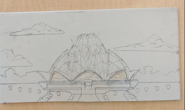
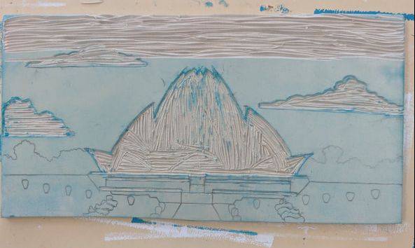
Print Making In Progress Pictures
|
|
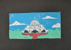
|
Print Making Final
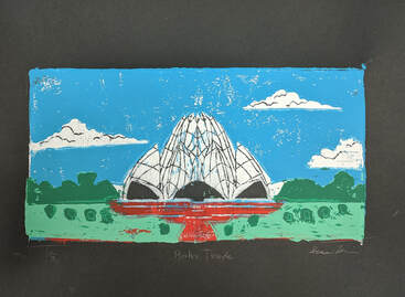
1.) I'd say the print overall is crafted okay. It's not great, but it's not entirely terrible. The biggest problem for me is the coloration, some colors didn't go down all the way and left blank spaces, and some went where they weren't supposed to. It's not bad enough where it distracts from the overall shape, but it could definitely be better.
2.) I unfortunately did not utilize texture very much, and instead relied on coloration to define and differentiate between separate entities in the print. Each color does do a good job standing out from one another though.
3.) I would definitely take more time to carve out the spaces and add some better texture. I would also add more paint on to the places that need it, and try to skirt over the ones that don't more carefully.
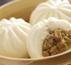
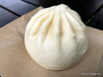
Clay Unit 20 Ideas and Reference Photos
|
|
|
|
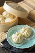
Clay Unit Final Project
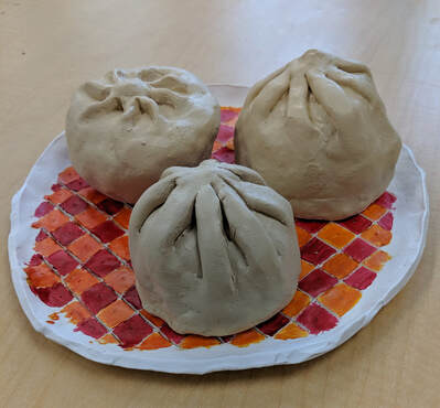
1.) I think overall the project is neat and well crafted, some of the edges could be a bit cleaner, and some of the seams more glossed over, but overall I think it went well.
2.) To me, the most difficult part of the project would be mending and combining two pieces of clay smoothly so that a crack or line wouldn't appear and possibly split the piece.
3.) For the steamed buns, I think the color works very well. For the plate however, I feel I could have done something better. I'm not sure what, but something about either the coloration or pattern throws me off.
4.) It's interesting from most views, unfortunately one of the bun's back broke off, so it has to be positioned in a way that you can't see the hole.
5.) When you sculpt something, you have to account for all sides whereas with a 2D piece you only have to worry about one vantage point. In my opinion, it's also much harder to add in small details in a sculpture.
6.) The only real texture this piece required would be on the ridges that top off the buns. For those, I rolled up pieces of clay and then attached and blended it into the top of the main clump.
7.) For the most part, these sculptures resemble the food they were supposed to be. The coloration, which was almost a pure white, was a little difficult to pull off, but the main shape was the challenge. The ridges especially were tricky to pull off, but I think the attempt was mostly successful.
8.) If I were to do this project again, I'd probably try to figure out another method to sculpt the ridges and hopefully get a more authentic result.
Painting Shading Chart
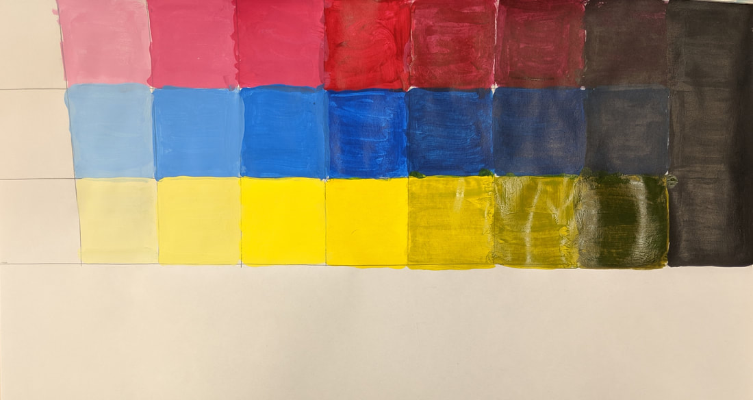
Color Wheel
Art 2 Final Reflection
In this class we covered many different aspects of art, many of them outside my comfort zone. We started doing something I was familiar with, drawing, and I felt like I gained a little more experience in that field along the way. After that we began working on projects that challenged me more, such as pen, colored pencils/pastels, printmaking, clay, then finally paint. Each part was varied and unique, and I felt my abilities as an artist were stretched very thin at times. In the end though, I definitely gained valuable knowledge in each of the subjects I tried, and although the results weren't always that great, I felt it was a good overall experience.
