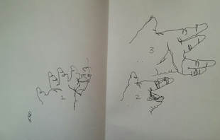
Blind contour drawing:
For this exercise we had to draw our hand in one continuous outline while looking only at our hands, and not at the paper.
For this exercise we had to draw our hand in one continuous outline while looking only at our hands, and not at the paper.
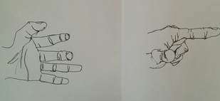
Modified contour drawing:
For the next exercise we had to again draw our hand in one continuous outline, but this time we were allowed to look at the paper when we did so, resulting in an evident increase in accuracy.
For the next exercise we had to again draw our hand in one continuous outline, but this time we were allowed to look at the paper when we did so, resulting in an evident increase in accuracy.
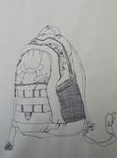
Book bag contour drawing:
For this we had to place an actual book bag on the table and draw it from our perspective using contour lines. This means that we not only didn't shade it, but that we couldn't pick up our pen unless absolutely necessary, resulting in smoother lines and features (mostly).
For this we had to place an actual book bag on the table and draw it from our perspective using contour lines. This means that we not only didn't shade it, but that we couldn't pick up our pen unless absolutely necessary, resulting in smoother lines and features (mostly).
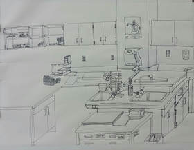
Room contour drawing:
1.) Did you use a fluid line? Explain how this is evident. I used fluid lines as best and as often as I could, though sometimes I did have to pick up my pencil to start a new shape or detail. For the most part I did use a single continuous line.
2.) The practice pieces, as well as previous experience I had drawing contour lines contributed quite a bit. The practices helped because I usually don't draw places, and previous experience helped my techniques.
3.) The difference between a contour and an outline drawing is that a contour drawing requires you to draw the shapes in a single line, not multiple like a sketch.
4.) How you interpret a line is important to me because to me, a line doesn't have to be a straight single stroke, it can be curved and bended and altered to give you interesting shapes and designs, which is essential in art.
5.) From this drawing I learned how to draw more carefully. I usually don't draw in pen, so doing so forced me to think over my next step because I couldn't just fix it. This is what I would fix if I had to do redo it, I would be more careful.
|
|
|
|
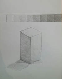
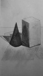
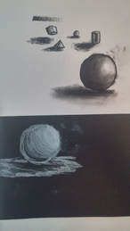
Value chart and shading:
These exercises intended to teach us about shading techniques. The chart is supposed to go from lightest to darkest value, while the shapes were more difficult. For those we had to look at 3 dimensional objects and draw the shading and hues realistically compared to what they actually looked like.
These exercises intended to teach us about shading techniques. The chart is supposed to go from lightest to darkest value, while the shapes were more difficult. For those we had to look at 3 dimensional objects and draw the shading and hues realistically compared to what they actually looked like.
|
|
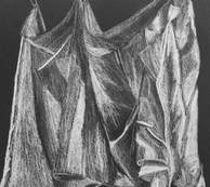
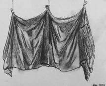
Fabric drawing practices:
For these, we had to choose to draw hanging fabric form different perspectives on different mediums. The white charcoal was an easier drawing utensil to work with, but I like the angle I chose for the regular charcoal piece better, it gives a better look at the shape of the fabric in my own opinion.
For these, we had to choose to draw hanging fabric form different perspectives on different mediums. The white charcoal was an easier drawing utensil to work with, but I like the angle I chose for the regular charcoal piece better, it gives a better look at the shape of the fabric in my own opinion.
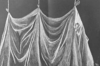
Fabric drawing final piece:
1.) I did use a wide range of values, ranging from the brightest white, to sometimes complete black. There are also many different variations of lighter and darker shades in between.
2.) The practices definitely helped with my knowledge in both the medium and utensil I used in the final, I rarely if ever worked with a black medium and had never drawn completely in white before. I have drawn fabric many times before, so this also aided me a lot.
3.) In this piece it was very challenging to fade the colors. I had to look at the fabric and judge how steeply I needed to blend the colors in the room I had available to do so. Blending with your finger was not allowed in this, and either way you can't really smudge white charcoal, so I had to usually start very light in a darker area, and then put more pressure on the pencil when the fabric started to get more light.
4.) Texture is very important for a piece of work like this, fabric is supposed to be very smooth, and so I had to draw certain parts flowing in a single direction that matches the actual piece of fabric. This gives it the nice gentle texture that fabric is supposed to be associated with.
5.) If I could do the project again I would add in more white charcoal. I noticed various places where you could still see the black canvas underneath the parts that were supposed to be shaded, and this could definitely be improved upon.
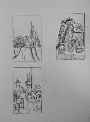
Still life practices:
For these you had to position yourself around the room while looking at a table cluttered with various objects. From the vantage point you chose you had to realistically draw the objects in both size and relation to each others position. After this you chose which one looked the best and had to then re-create it for your final.
For these you had to position yourself around the room while looking at a table cluttered with various objects. From the vantage point you chose you had to realistically draw the objects in both size and relation to each others position. After this you chose which one looked the best and had to then re-create it for your final.
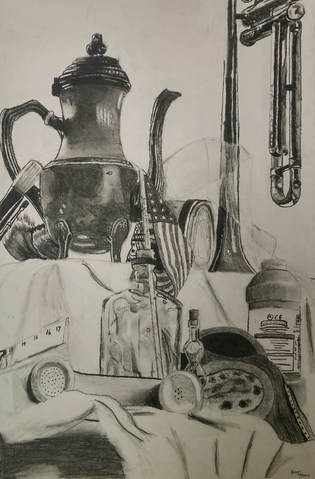
Still Life Final:
1.) I tried to use every practice in this piece, the values are both shaded and smudged for smooth shapes when needed, yet still retain a clear outline to better indicate placement in relation to each other.
2.) I believe the values are realistic and shaded, I tried to include a wide variety of values to better indicate which object was which. Values and shading are vital if you want your art to be realistic.
3.) There is no clear source of lighting in the picture, many of the items were highly reflective, being made of metal, polished plastic, or glass.
4.) The compositional sketches were very important, as they made us think through which vantage point would be the best to draw from.
5.) I think my final drawing is successful is terms of shading and realism.
6.) The shapes and spacing all are accurate in comparison to real life, the only thing that was a challenge was the cloth behind the telephone.
7.) The arrangement of the pieces pleases me, as it has a wide variety of objects with interesting shapes and placements.
8.) There is no clear center of interest, though the tea kettle seems to draw a lot of attention from people.
9.) I did not manage my time on this very well, though I used the amount of time I did to improve the drawing to the point that it is.
10.) The main challenge was making everything look realistic. I achieved this by not drawing what I thought I saw, but by drawing what was actually there.
11.) I have learned not to guess at what to draw, but to draw things exactly how I see it to achieve the greatest factor of realism in a piece.
|
|
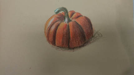
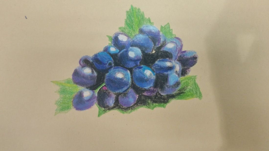
Color pencil drawing, Pumpkin and Grapes:
For this exercise, we started using colored pencils in the class for the first time. In this we used prismacolor colored pencils, which easily blend for a better looking finished product. We had to draw two plants, a pumpkin and some grapes using the colored pencils while looking at an actual photograph. This is one of the few times I have used colored pencils, and one of the more successful occasions. The outcome looks better than if I had used a regular charcoal pencil, and gives off a more realistic feel to it, though the grapes could have had a nicer blend on them, and the color seems to differentiate between a few of them somewhat.
For this exercise, we started using colored pencils in the class for the first time. In this we used prismacolor colored pencils, which easily blend for a better looking finished product. We had to draw two plants, a pumpkin and some grapes using the colored pencils while looking at an actual photograph. This is one of the few times I have used colored pencils, and one of the more successful occasions. The outcome looks better than if I had used a regular charcoal pencil, and gives off a more realistic feel to it, though the grapes could have had a nicer blend on them, and the color seems to differentiate between a few of them somewhat.
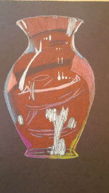
Glass Drawing:
For this short project, we looked at glass vases in front of colored paper and tried to draw and color them as accurately as possible. I had a tough time with mine, as it had not patterns on it, just a smooth vase shape that was hard to mimic reflections and refractions in.
For this short project, we looked at glass vases in front of colored paper and tried to draw and color them as accurately as possible. I had a tough time with mine, as it had not patterns on it, just a smooth vase shape that was hard to mimic reflections and refractions in.
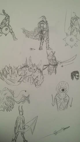
Foreshortening sketches:
For this we had to come up with ideas for foreshortening, meaning an object that extends towards the viewer. We made a list of twenty ideas then picked two, and drew four sketches of each.
For this we had to come up with ideas for foreshortening, meaning an object that extends towards the viewer. We made a list of twenty ideas then picked two, and drew four sketches of each.
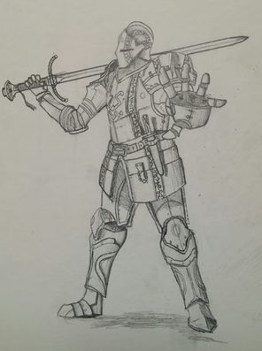
Foreshortening Final:
For the final piece I chose to draw a knight, I had some difficulties figuring out what part to foreshorten but I eventually chose the hand. The rest was also difficult, as I had to add in lots of detail while also making it look feasible and realistic. Shading also gave me some difficulties as it had to correspond to the shapes and edges of the armor.
For the final piece I chose to draw a knight, I had some difficulties figuring out what part to foreshorten but I eventually chose the hand. The rest was also difficult, as I had to add in lots of detail while also making it look feasible and realistic. Shading also gave me some difficulties as it had to correspond to the shapes and edges of the armor.
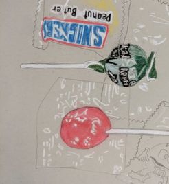
Candy Drawing: This piece was based on a real scattering of candy placed on the table. We drew it in pencil first then colored it in with pastels. The hardest part about this was trying to add in details with color.
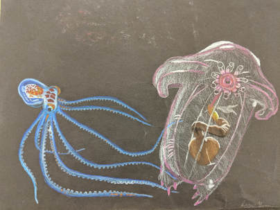
Opacity Drawing
1.) The drawing is well organized and executed in the way I foresaw
2.) The background works good with the objects or animals because they live in the deep sea, where everything is dark.
3.) I chose bright and vibrant colors that were both accurate to the animal and noticable against the dark background.
4.) The contrast in this piece comes from the sea creatures. Their colors clash with the black and each other, giving a wide variety.
5.) While not much shadow is used aside from the background, both creatures have many highlights on them, especially the sea cucumber, which adds depth and lighting to the piece.
6.) The black background was chosen to distinguish and bring attention to the main points of focus, the octopus and sea cucumber.
7.) Understanding the media, in this case a special type of colored pencils, is very important. You need to know where and how to blend them, as well as how to get the amount of color and right texture down.
8.) I had difficulties with the whites and textures of the sea cucumber.
|
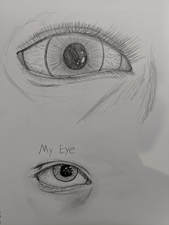
Feature sketches: These were where we sketched parts of our faces for practice. This particular piece was of the eyeball. The top image was a free hand one, while the one on the bottom was drawn while looking at a picture of my own eye.
|
|
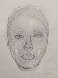
This piece was to make sure the features of your face were placed correctly in proportion to a real skull.
|
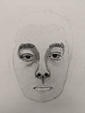
This was a free drawn picture of my face without any guidelines or skulls underneath. This is from a picture taken of me up close. This was a very challenging piece, requiring both detail and correct placement/spacing.
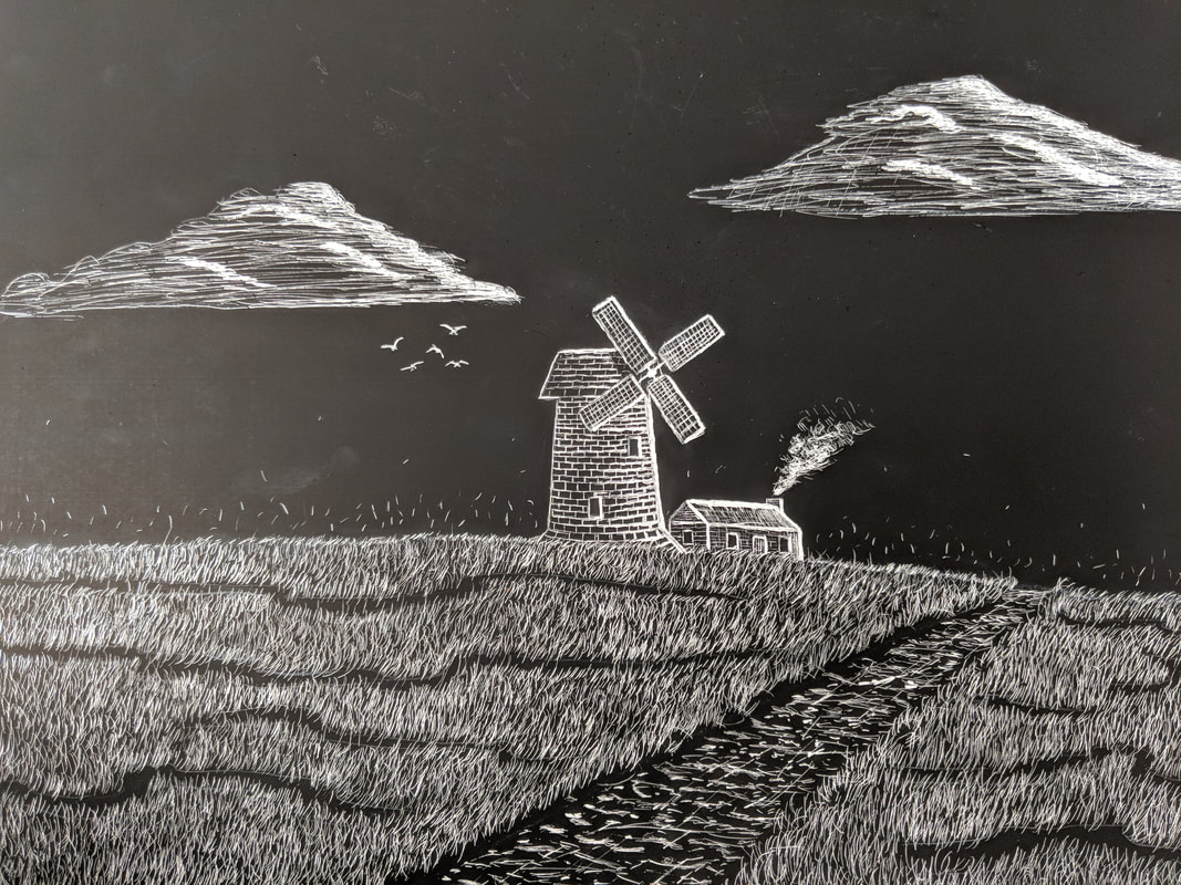
This is a scratchboard piece I did, it involves using tools to scrape away the black material to make the white canvas beneath visible. The underlying theme of this project was movement, which I attempted to portray through the windmill blades, grass, creek, smoke from the chimney, and the birds. While there are some areas that could be improved I think overall it's a success.