Drawing Final Exam
|
|
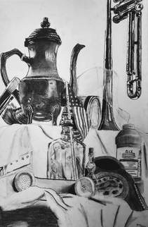
Even though the project was a straightforward concept, it was still very challenging to me. I had done still life pieces before, but never with a charcoal pencil. Another challenging aspect was the glass bottles/containers. I had never attempted to draw glass realistically, and the first time it was just a small piece in a bigger picture, making it harder. The perspective was also hard for me to grasp, I'm used to straightforward views of my drawings so an upper angle was challenging. Besides the glass, the hardest object to accurately draw was the trumpet, it had so many pieces they seemed to blend in up close, but you could see them from a distance, so getting the lighting down was very difficult. There was also the lace, which was hard to see and harder to draw on a black and white coloration palate. Overall one thing I did to challenge myself was to look at each little individual space to draw it accurately instead of trying to draw it as a whole, which is what I usually do. |
|
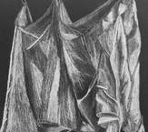
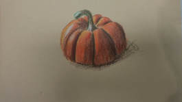
2: The first picture is of a fabric drawing I did, it was on a black canvas with a white pencil. The second was a colored drawing of a pumpkin. Both were drawn using a reference. There was an apparent improvement in skill between the two pieces, an obvious one being the implementation of color in the second. While the techniques were largely the same, my ability to copy a real object were improved between the two pictures, resulting in a more accurately drawn piece.
|
3: While the portfolio did do an overall accurate job at showing my growth in the class, there were many practice drawings that are not show here that demonstrate rough practice and progress. They helped me learn basic techniques for bigger projects.

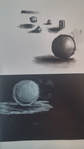
6: My favorite medium to work with was charcoal pencils. I like smooth colors and shades in my pieces, they help them to flow and seem more orderly. Charcoal does this effect the best out of the mediums I've worked with, especially with blending stubs. The still life piece mentioned before and shown here demonstrate the nice textures you can get with charcoal.
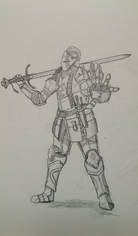
7: I feel this piece was my least successful. It was supposed to show perspective or foreshortening, and neither of those was achieved very well. The hand is not large enough and in so is not the main focus as it should be. The piece fails in getting the foreshortening effect in this regard. Furthermore the knight does not even look that good. The arms and legs are placed oddly, the armor design is mediocre, and there is a lack of shading and background.
